There are many ways to make maps with R. The two general types are: vector maps where regions are represented by a set of points and lines around region boundaries and tile maps where a pre-drawn map is downloaded from a cloud service such as Google maps. In both cases, points, lines, and colour tiles can be added to display data on the map. Vector maps are drawn from a series of points and so can be drawn using many different projections, giving you the freedom to choose the projection most suitable for your map. Tile maps are images and can’t be reprojected, but can have a lot of information on them in the form of colours for terrain, labels, and points of interest. Tile maps can be used in a pan-and-zoom mode like many familiar online mapping tools.
In this lesson we will look at drawing vector maps.
28.1 Vector map
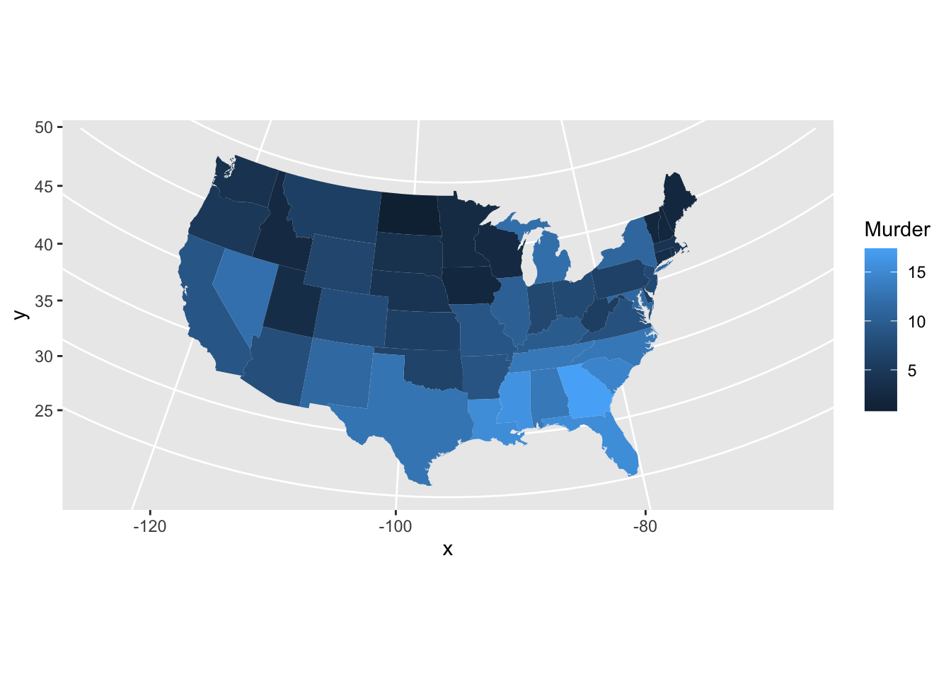
Here is a map of the 48 continental US states, with a quantitative variable used to shade each region. To change the variable used to colour the states, simply provide a new dataset with a numeric column and a text column called “state”. The map is drawn with ggplot, so the other features of ggplot including annotation, setting colour scales, labeling axes, etc., are all available to you and work the same way as for other visualizations we have created. The function expand_limits sets the range of latitudes and longitudes that will be displayed. Here I’m using a base-R syntax (states_map$long) to access these data and get the range (smallest and largest) longitude and latitude. Finally, the coord_map function creates a projection from a piece of a sphere onto a flat page. Other projections you can try include Mollweide (coord_map("mollweide")) and azimuthal equal area (coord_map("azequalarea")). There are many projections. See the help for coord_map for more information.
states_map<-map_data("state")crimes<-USArrests|>rownames_to_column("state")|>mutate(state =str_to_lower(state))ggplot(crimes, aes(map_id =state))+geom_map(aes(fill =Murder), color ="white", linewidth =0.2, map =states_map)+expand_limits(x =states_map$long, y =states_map$lat)+coord_map("albers", 23, 100)
The geom_map function makes it easy to draw a vector map. Sometimes we need a different approach using the simple features (sf) library. Here is another way to draw the same map.
states_sf<-st_as_sf(maps::map("state", plot =FALSE, fill =TRUE))map_data<-states_sf|>left_join(crimes, by =c("ID"="state"))ggplot(map_data)+geom_sf(aes(fill =Murder), color ="white", size =0.2)+coord_sf(crs =st_crs(5070))# Albers Conic Equal Area
The map_data function works with maps from the maps package, including two world maps (world and world2) and detailed maps of France, Italy, New Zealand, the USA and its states. The maps package has several other datasets including a list of Canadian cities with population greater than about 1000. The world is a large and complex place and you will often need to obtain data and map boundaries for regions which are not readily available in this package. Some guidance appears at the end of the lesson, but this can be a challenging task.
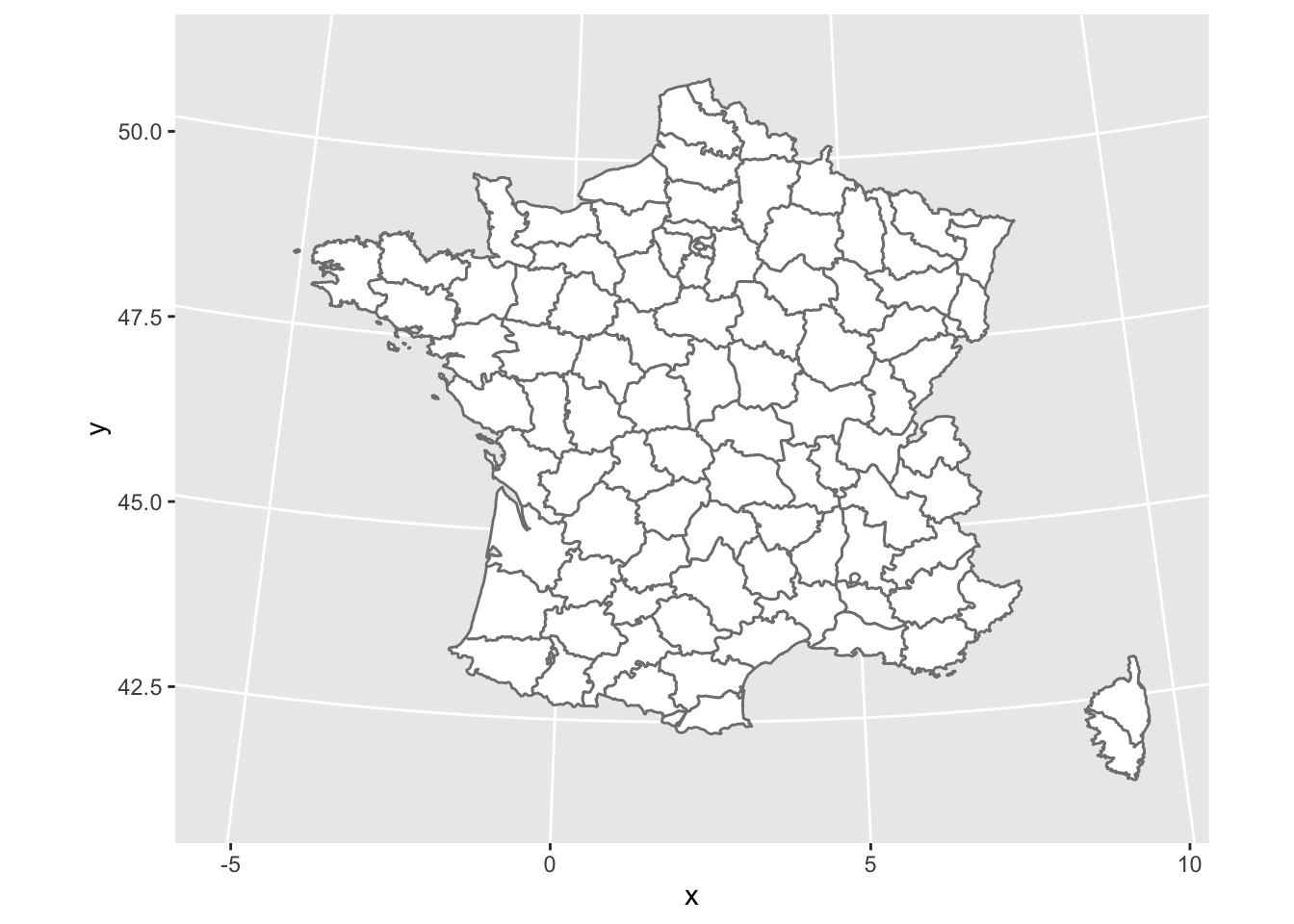
The surface of the Earth is curved, so choices need to be made when plotting it on a flat surface. These choices are called projections. Here’s a map of France using an azimuthal equidistant projection (see mapproj::mapproject() for more examples):
france_sf<-st_as_sf(maps::map("france", plot =FALSE, fill =TRUE))# Define the Azimuthal Equidistant projection centered on France (approx 46.5°N, 2.5°E)# Alternatively, use a standard EPSG like 2154 (Lambert-93) for official French maps# crs_france <- "+proj=aeqd +lat_0=46.5 +lon_0=2.5 +units=m"crs_france<-st_crs(2154)ggplot(data =france_sf)+geom_sf(fill ="white", color ="#7f7f7f")+coord_sf(crs =crs_france)
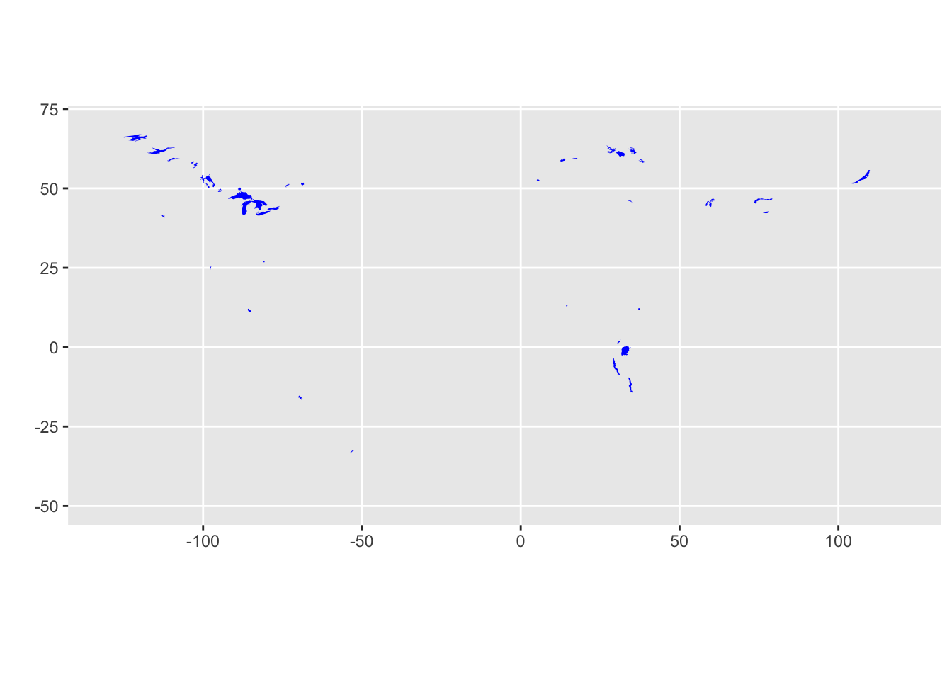
Not all maps are political: here is a map of large lakes throughout the world.
lakes_sf<-st_as_sf(maps::map("lakes", plot =FALSE, fill =TRUE))|>st_make_valid()ggplot(data =lakes_sf)+geom_sf(fill ="blue", color =NA, alpha =1.0)+coord_sf(crs ="+proj=moll")+labs(x ="", y ="")
Incidentally, a frequently used projection for the USA is the Bonne. Revise the USA map to use that projection by adding the following code + coord_map("bonne", 45). (Albers: coord_map("albers", 40, 100) and Lambert: coord_map("lambert", 40, 100) are also used, although Lambert makes the USA look very wide in the North.)
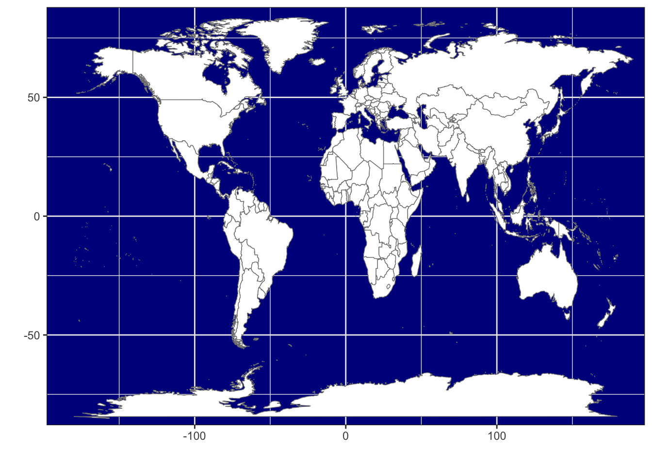
Political boundaries for the world are available as “world” (centred on the Atlantic Ocean) or “world2” (centered on the Pacific Ocean.)
WorldData<-map_data('world')ggplot()+geom_map(data =WorldData, aes(map_id=region), map =WorldData, fill ="white", colour ="#7f7f7f", alpha =1, linewidth=0.25)+expand_limits(x =c(-180, 180), y =c(-80, 80))+theme_bw()+theme(panel.background =element_rect(fill ="darkblue"))+labs(x="", y="")
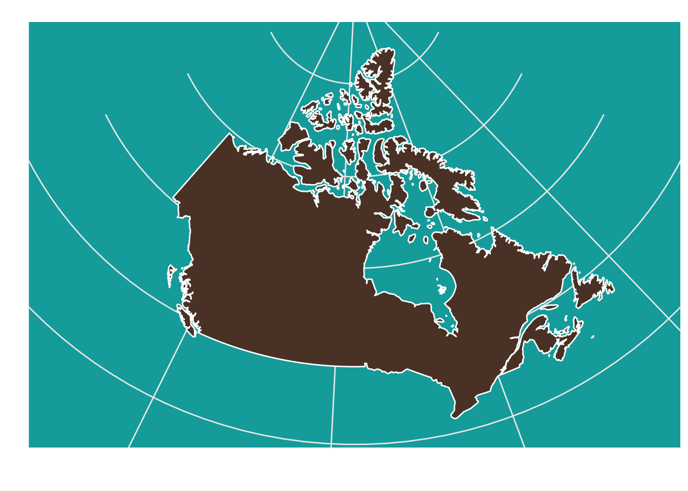
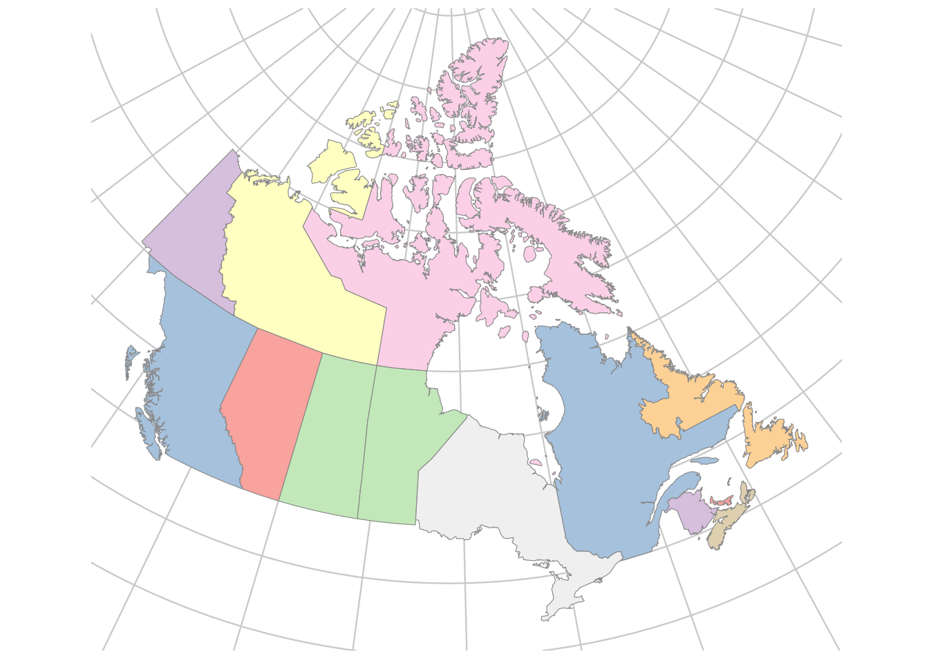
You can select a specific country if you want, for example, Canada. This is a reasonable map of Canada made up of 141 regions (main land mass plus islands), but it doesn’t have any provincial boundaries, lakes, or other detail:
canada_sf<-st_as_sf(maps::map("world", "Canada", plot =FALSE, fill =TRUE))ggplot(data =canada_sf)+geom_sf(fill ="#5C4033", color ="white", size =0.2)+# coord_sf using the official Canada Atlas Lambert projection (EPSG:3978)coord_sf(crs =st_crs(3978))+theme( panel.background =element_rect(fill ="#00AAAA"), panel.border =element_blank(), axis.text =element_blank(), axis.ticks =element_blank())+labs(x =NULL, y =NULL)
Here is a list of 252 regions available in the world map (abbreviated here to the first 40).
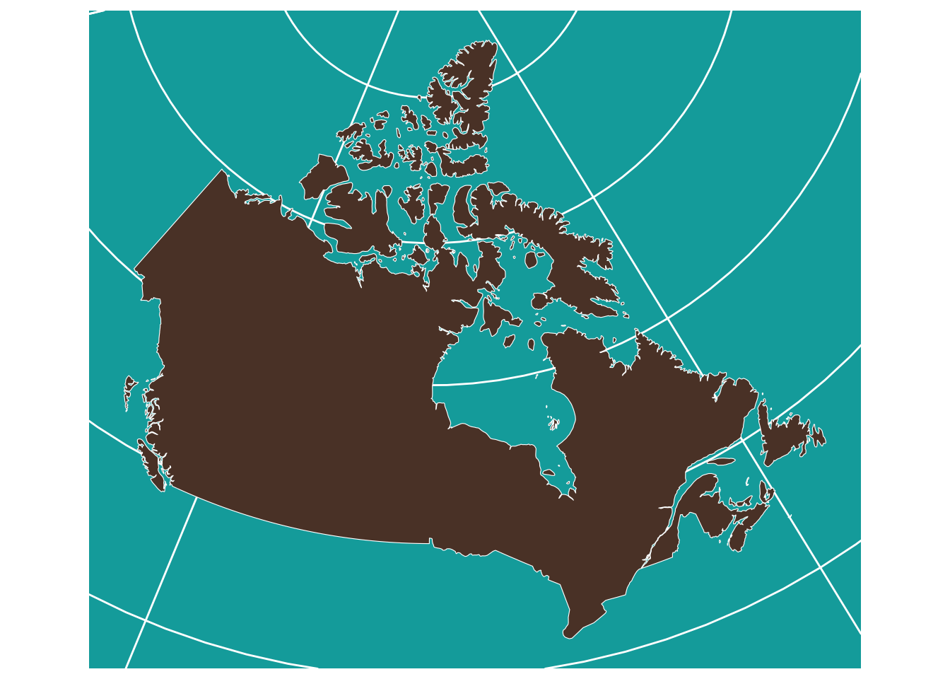
The map of the globe and even of Canada does not look good at high latitudes, especially if either pole is included. Here is a projection that is a bit more suitable for those regions. The geom_map function is not perfect; it creates stray lines when a region is clipped by the projection.
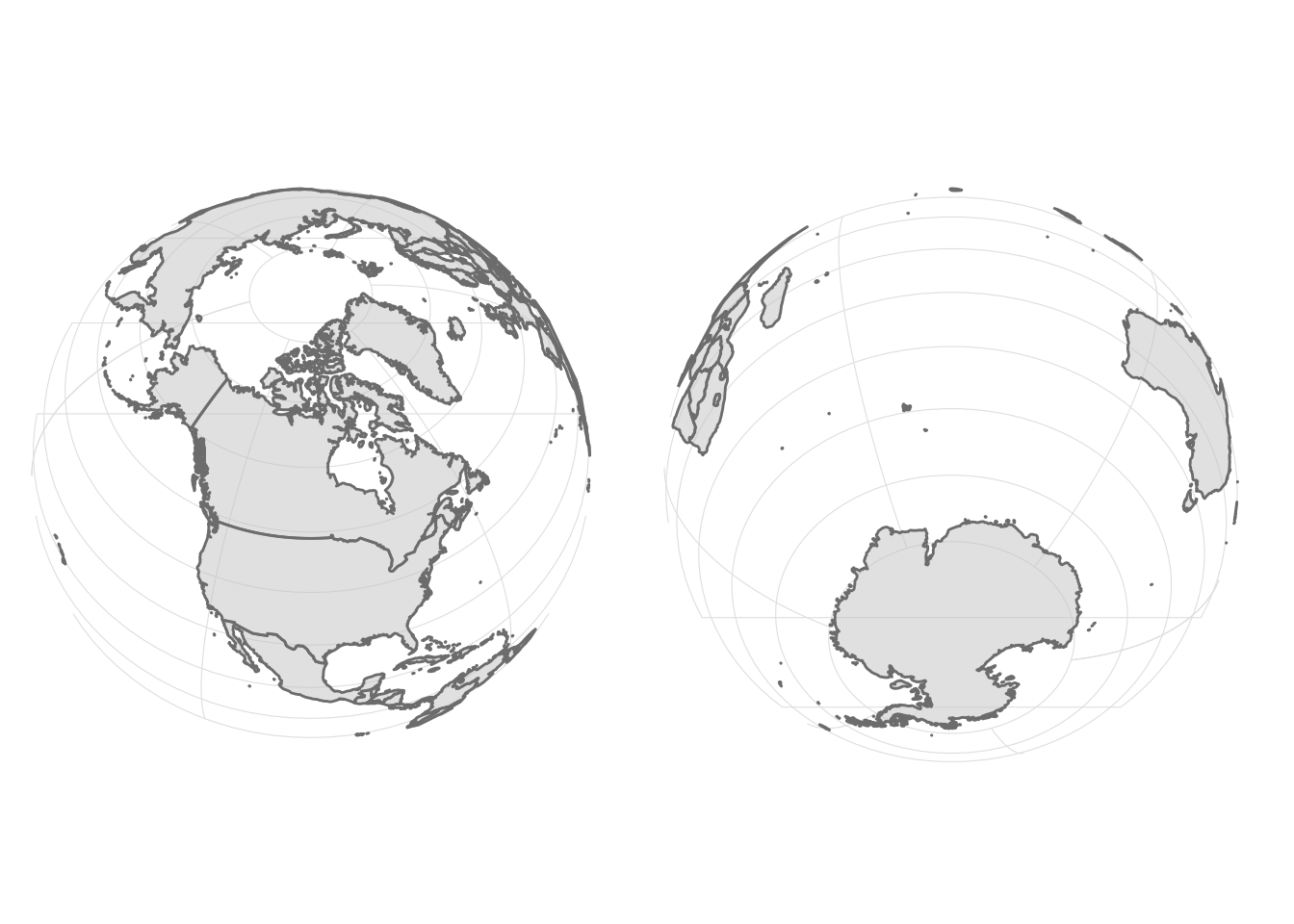
world_sf<-st_as_sf(maps::map("world", plot =FALSE, fill =TRUE))|>st_make_valid()p1_sf<-ggplot(data =world_sf)+geom_sf(fill ="gray80", color ="#7f7f7f", alpha =0.5, linewidth =0.5)+theme_bw()+theme( axis.text =element_blank(), axis.ticks =element_blank(), panel.grid =element_line(color ="gray90", linewidth =0.2), # Adds a subtle graticule rect =element_blank())+labs(x =NULL, y =NULL)# Create the perspective views (distance in meters = 2.5 Earth radii)dist<-2.5*6371000p2a_sf<-p1_sf+coord_sf(crs =paste0("+proj=nsper +h=", dist, " +lat_0=60 +lon_0=-100"))p2b_sf<-p1_sf+coord_sf(crs =paste0("+proj=nsper +h=", dist, " +lat_0=-60 +lon_0=80"))p2a_sf+p2b_sf
You should experiment with the geom_sf function. Try drawing maps of different regions of the world and changing colours for fills and lines. Search for some EPSG coordinate systems to experiment with different projections as well.
If (when!) you run into difficulties, LLM tools can often provide useful fixes to any errors you make.
28.2 Detailed maps of Canada
Detailed maps of Canada are not part of the maps package in R, but map data are available in many places on the internet. I obtained a “shapefile” from Statistics Canada and transformed it to work with R. The packages needed to do this have been reworked recently, so lots of advice on the internet is out of date. Look for the packages sf, stars, terra, geojsonio and rmapshaper.
I used shape files for the 2011 census divisions in Canada. There are many other options. Choose ARCGis .shp file format. Pick the cartographic boundary file. You should get a zip file called gpr_000b11a_e. The shapefiles are very detailed and need to be simplified before being plotted with R. You can obtain the simplified files here.
28.2.1 Draw the map
Download the file, read the map data into R and get to mapmaking.
The official projection for maps of Canada is the Lambert conformal conic (“lcc”) with the following latitude and longitude parameters. These complicated strings are now considered the old way of making projections. A function crs in the package terra can now be used instead – details not shown!
Since our axes on our plot are not just longitude and latitude, we need to convert (project) the longitudes and latitudes to map coordinates. There are several steps: select only the numerical latitude and longitude coordinates, convert the data frame to a matrix, convert to a “simple feature” consisting of a set of points, make it back into a table, and add a projection onto to the data.
sf_cities=city_coords|>select(long, lat)|>as.matrix()|>st_multipoint(dim ='XY')|>st_sfc()|>st_set_crs(4326)# 4269 also works
Make the map with projected points.
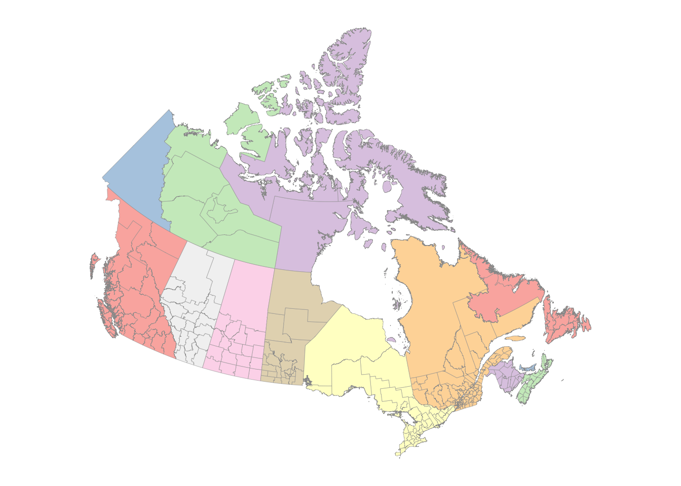
ggplot()+geom_sf(aes(fill =PRUID), color ="gray60", linewidth =0.1, data =canada_cd)+geom_sf(data =sf_cities, color ='#001e73', alpha =0.5, size =3)+# 17coord_sf(crs =crs_string)+scale_fill_manual(values =map_colors)+guides(fill ="none")+theme_map()+theme(panel.grid.major =element_line(color ="white"), legend.key =element_rect(color ="gray40", size =0.1))
Warning: The `size` argument of `element_rect()` is deprecated as of ggplot2 3.4.0.
ℹ Please use the `linewidth` argument instead.
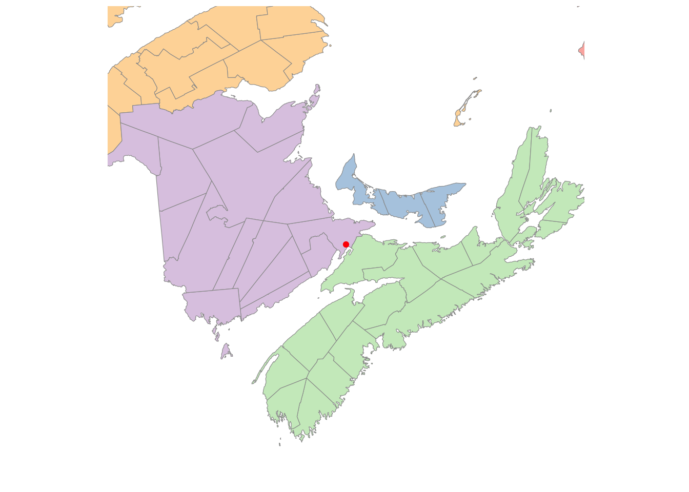
It’s easy to focus in on the Maritimes region of Canada – just filter the data to include only the province or census districts you want. Here are some of the names in the map data that you can use for filtering.
I’ve changed the latitude and longitude parameters for the projection to values more suitable for this part of Canada.
crs_string2="+proj=lcc +lat_1=40 +lat_2=50 +lon_0=-75 +x_0=0 +y_0=0 +datum=NAD83 +units=m +no_defs"ggplot()+# geom_sf(data = sf_cities, color = '#001e73', alpha = 0.5, size = 3) +geom_sf(aes(fill =PRUID), color ="gray60", linewidth =0.1, data =canada_cd|>filter(PRNAME%in%c("Nova Scotia / Nouvelle-Écosse", "New Brunswick / Nouveau-Brunswick", "Prince Edward Island / Île-du-Prince-Édouard")))+coord_sf(crs =crs_string2)+scale_fill_manual(values =map_colors)+guides(fill =FALSE)+theme_map()+theme(panel.grid.major =element_line(color ="white"), legend.key =element_rect(color ="gray40", size =0.1))
Warning: The `<scale>` argument of `guides()` cannot be `FALSE`. Use "none" instead as
of ggplot2 3.3.4.
You can also crop the data to be drawn or the projected map. This is a bit more complex than you might expect since you need to be sure you are specifying the area to be plotted and the actual projected coordinates in the same coordinate system. You can easily get errors (invalid points in a projection), empty maps, or croppings that don’t look right. See the link at the start of this paragraph for several approaches.
crs_lcc<-"+proj=lcc +lat_1=40 +lat_2=50 +lon_0=-75 +datum=NAD83 +units=m"zoom_to_coords<-c(-64.3683, 45.8979)# Centered on Sackville NBspan_meters<-600000# zoom 6 at this latitude is roughly a 600km window# Create the center point and project ittarget_pt<-st_sfc(st_point(zoom_to_coords), crs =4326)|>st_transform(crs =crs_lcc)# Create a bounding box and a perfect square window in the target projectionview_bbox<-target_pt|>st_buffer(dist =span_meters/2)|>st_bbox()ggplot()+geom_sf(data =canada_cd, aes(fill =PRUID), color ="gray60", linewidth =0.1)+geom_sf(data =target_pt, color ="red", size =2)+# Use the bbox directly for xlim and ylimcoord_sf( xlim =c(view_bbox["xmin"], view_bbox["xmax"]), ylim =c(view_bbox["ymin"], view_bbox["ymax"]), crs =crs_lcc, datum =st_crs(4326)# Shows Lat/Lon graticules even if projected)+scale_fill_manual(values =map_colors, guide ="none")+theme_minimal()+# theme_map is often restrictive; minimal is a good basetheme( panel.grid.major =element_line(color ="white", linewidth =0.2), panel.background =element_rect(fill ="aliceblue", color =NA))
28.2.2 Just the map, please
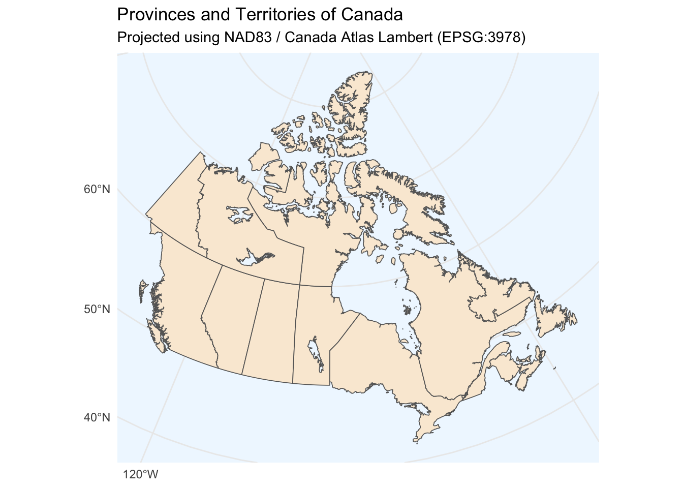
Here is a map with province boundaries that can be used without showing the census district regions. I’ve added a latitude-longitude grid to the map.
# Fetch provincial/territorial boundaries# 'community' level provides provinces/statescanada_prov<-ne_states(country ="canada", returnclass ="sf")ggplot(data =canada_prov)+geom_sf(fill ="antiquewhite", color ="gray40", linewidth =0.3)+# coord_sf handles the projection math automaticallycoord_sf(crs =st_crs(3978))+theme_minimal()+labs( title ="Provinces and Territories of Canada", subtitle ="Projected using NAD83 / Canada Atlas Lambert (EPSG:3978)", x =NULL, y =NULL)+theme(panel.background =element_rect(fill ="aliceblue", color =NA))
28.3 Summary
Map making is complex for at least two reasons: obtaining the data to describe complex political boundaries and using suitable projections for your data. This lesson introduced you to some simple solutions to both problems and gave a starting point for learning more about the complexity of making customized maps.
28.4 Packages used
In addition to tidyverse which has ggplot and the geom_map function, I’ve used
sf for working with “simple features”, meaning points, lines, regions and other features to draw on maps, e.g., functions st_read, st_as_sf
rnaturalearth for map data
maps and mapproj for map projections
patchwork for combining ggplots together
If you are not sure a package is needed, don’t include it in your R markdown document, but if something doesn’t work, you have this list to help you figure out what package is required.