29 Alternatives to maps
Sometimes geospatial data doesn’t need to be shown on a map. If there are a small number of categories – for example the provinces of Canada – a regular boxplot or dotplot (scatterplot with a categorical axis) can work just fine. We are very used to seeing coloured maps of the United States, but these distort data in ways that people rarely recognize. For example, we often care about the number of people affected by a factor and maps serve to confuse area and population. There are tricks (and more tricks) like shading and adjusting regions to the population size, but perceptual problems persist. We rarely see maps like this for Canada because the way population and political power is distributed is very different in Canada compared to the USA.
In this lesson we will look ways to show data with spatial dimensions in ways that don’t involve a map. but still reflect the geographic nature of the data. These methods show a quantitative variable with colour and shading while arranging space (and sometimes time) along the two spatial dimensions of the plot. As a result they suffer many of the perceptual issues with decoding colour and shading into quantitative comparisons. They are most useful for broad overviews of data and conveying general impressions, but you must always be careful that your presentation doesn’t mislead you or your reader.
29.1 Heatmaps
Suppose we want to show a combination of spatial and temporal data. The geographic data is important, but the location on a map is not the most important feature. As an example, consider this data on total cases of COVID-19 in 5 regions of Canada reported on 2021-01-21. In the code below I select the number of cases identified broken down into age classes and geographic regions. The number of cases is presented as a shade of blue using geom_tile.
covid <- cansim::get_cansim("13-10-0775-01")## Accessing CANSIM NDM product 13-10-0775 from Statistics Canada## Parsing data## Folding in metadata
# covid2 <- get_cansim("13-10-0774-01")  # related data with extra information
covid_ss <- covid %>% filter(GEO != "Canada", Gender == "Total, all genders", `Age group` != "Total, all age groups") %>%
  filter(Statistics == "Community exposures")
covid_ss %>%
  ggplot(aes(y = GEO, x = `Age group`, fill = VALUE)) +
  geom_tile() +
  theme(axis.text.x = element_text(angle = 90))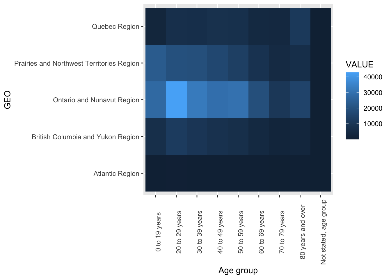
There are two common ways to improve a figure like this. First is to ensure the ordering of categorical variables is easily interpreted. Here we would remove hte “Not stated” age group and order the geographic regions from west to east to follow Canadian convention. We might swap the x and y axes to align left-right flow with the west-east geography of Canada.
covid_ss2 <- covid_ss %>% filter(`Age group` != "Not stated, age group")
regions <- c("BC + Yukon", "Prairies + NWT",
             "ON + NU", "QC", "Atlantic")
covid_ss3 <- covid_ss2 %>%
  mutate(GEO = fct_recode(GEO, "BC + Yukon" = "British Columbia and Yukon Region",
              "Prairies + NWT" = "Prairies and Northwest Territories Region",
              "ON + NU" = "Ontario and Nunavut Region",
             "QC"  =  "Quebec Region",
             "Atlantic" = "Atlantic Region"))
covid_ss3 %>%
  ggplot(aes(x = fct_relevel(GEO, regions),
             y = `Age group`, fill = VALUE)) +
  geom_tile() +
  theme(axis.text.x = element_text(angle = 90))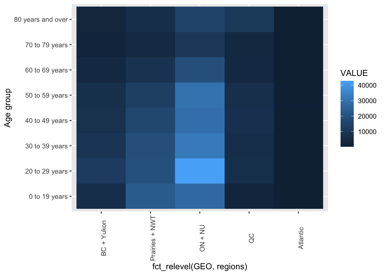
A second approach is to group the rows and columns so that similar patterns are side by side. The ggheatmap function in the ggheatmap package makes this easy.
covid_ss4 <- covid_ss3 %>% select(GEO, `Age group`, VALUE) %>%
  pivot_wider(names_from = GEO, values_from = VALUE)
data.frame(covid_ss4 %>% select(-`Age group`),
              row.names = covid_ss4 %>% pull(`Age group`)) %>%
  ggheatmap()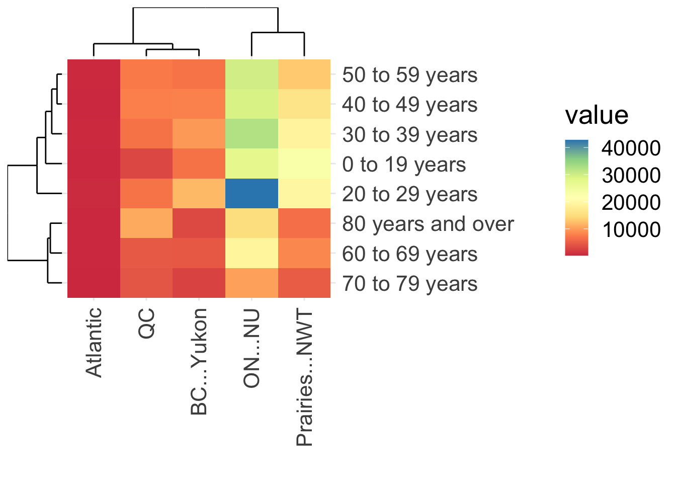
From this analysis you can tell that the number of cases is structured by age (see the tree on left side of the plot) and geographically. The number of people in each region is very different, so you might want to account for that in some way. One approach would be to compute the cases per capita in each region, but I don’t have those data handy. An alternative is to allocate the number of cases to age classes as proportions, by dividing the number of cases in each region and age group by the total in each region. We can use scale to accomplish that scaling. Now the color represents the proportion of COVID-19 cases in each age class, scaled within a region.
data.frame(covid_ss4 %>% select(-`Age group`),
              row.names = covid_ss4 %>% pull(`Age group`)) %>%
  scale(center = FALSE, scale = colSums(.)) %>%
  as.data.frame() %>%
  ggheatmap()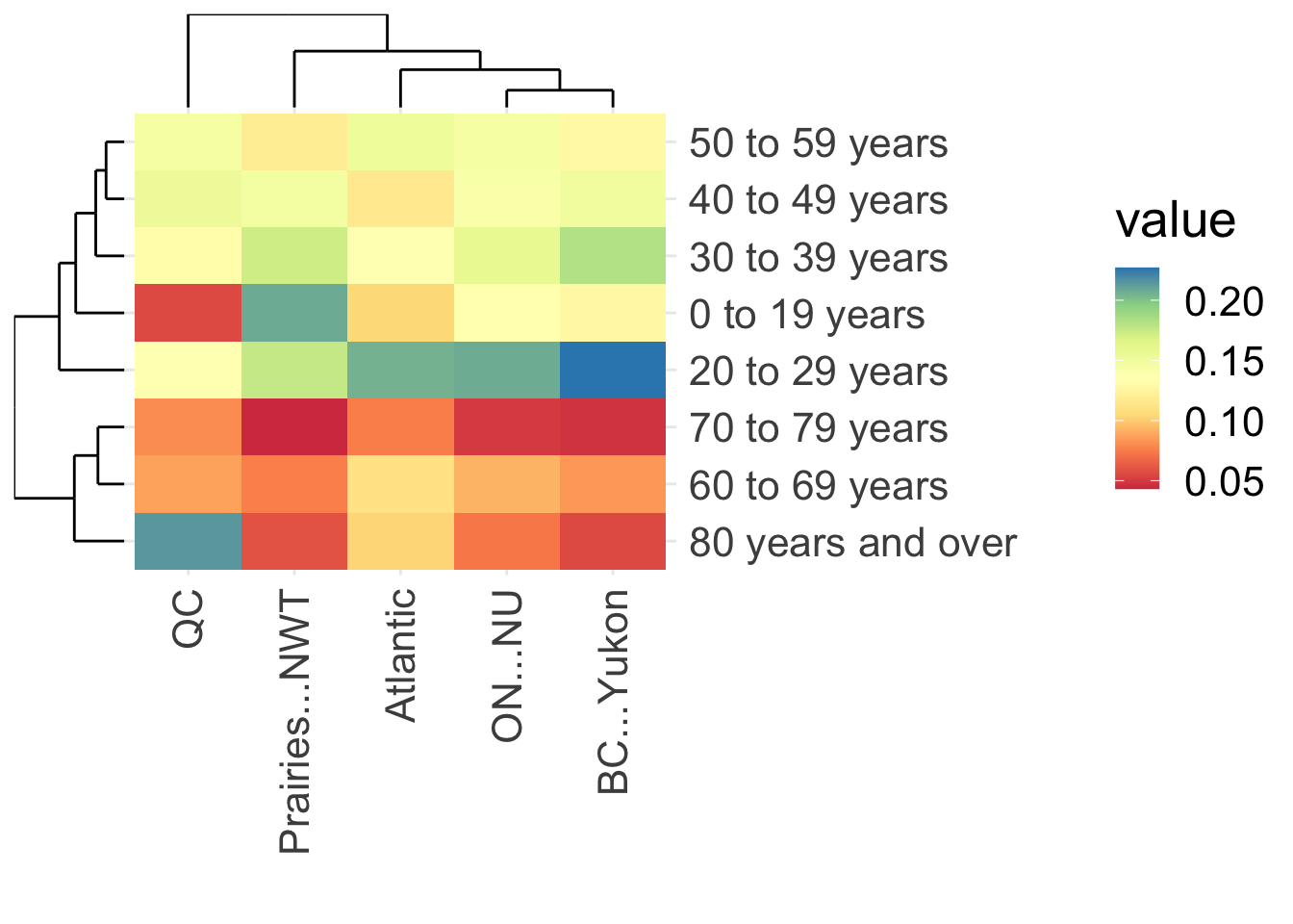
Matching the previous visualization, we see that the proportion of cases is higher in people age 60 and older compared to younger groups. We now also see that the highest proportion of cases (about 20% or more) was in inviduals aged 80 and over in Quebec and in the 20-29 age group in BC and Yukon. The distribution of cases across ages was most similar between Ontario + Nunavut and BC + Yukon.
29.2 Specialized maps of the USA
Customization of any visualization is always possible, but takes time to develop. Maps of the USA are very common, so a huge number of variations have been developed. Here is a kind of heatmap: each state is the same size and the states are arranged in an approximate geographic representation of the USA. (Example adapted from Healy Section 7.3.)
library(statebins)
load("static/election.rda")
election %>% ggplot(aes(state = state, fill = pct_trump)) +
  geom_statebins() +
  theme_statebins() +
  labs(fill="Percent Trump")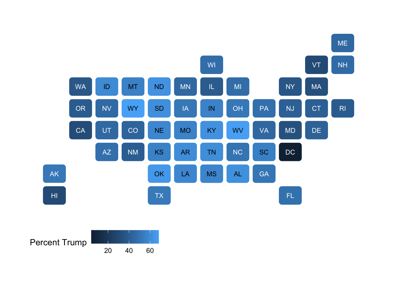
29.3 Summary
Maps are commonly used in data visualization to display data (quantitative or categorical) over a geographical area, when the geography will provide insight into patterns in the data. Maps can be misleading because the area of the region (province, state, country) may have little to do with the message you want to communicate, but the area on a data visualization usually has greater impact than the color hue or brightness which is used to encode the primary data.
For these reasons, you should consider alternatives to maps even when your data are clearly geographic. All the visualizations we have used in this course that permit a categorical variable can be useful. In this lesson we added one more, the heatmap, which is like a map, except all the regions are the same area and the “geographic” trend is arranged along one axis.
29.4 Further reading
- Healy Chapter 7 Maps