Alternatives to maps
2026-03-26
Population maps
USA population by state
Population maps II
USA population by county
Canada population
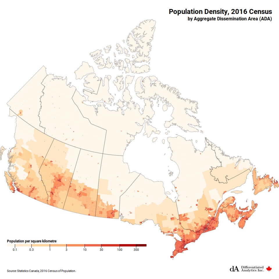
Canada population
Population maps III
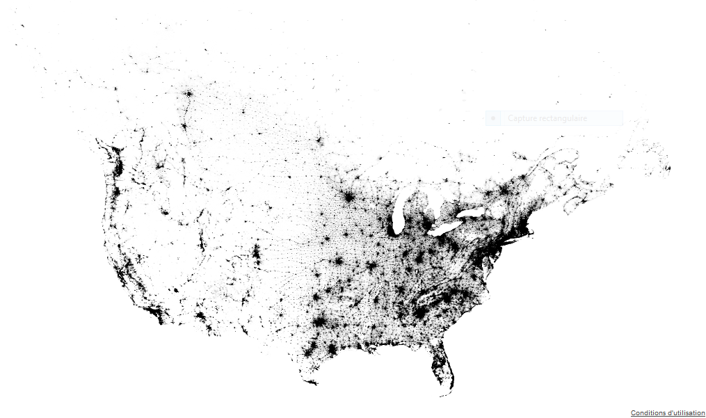
Canada USA population dot map
Nighttime image of Earth

NASA composite image of night time North America
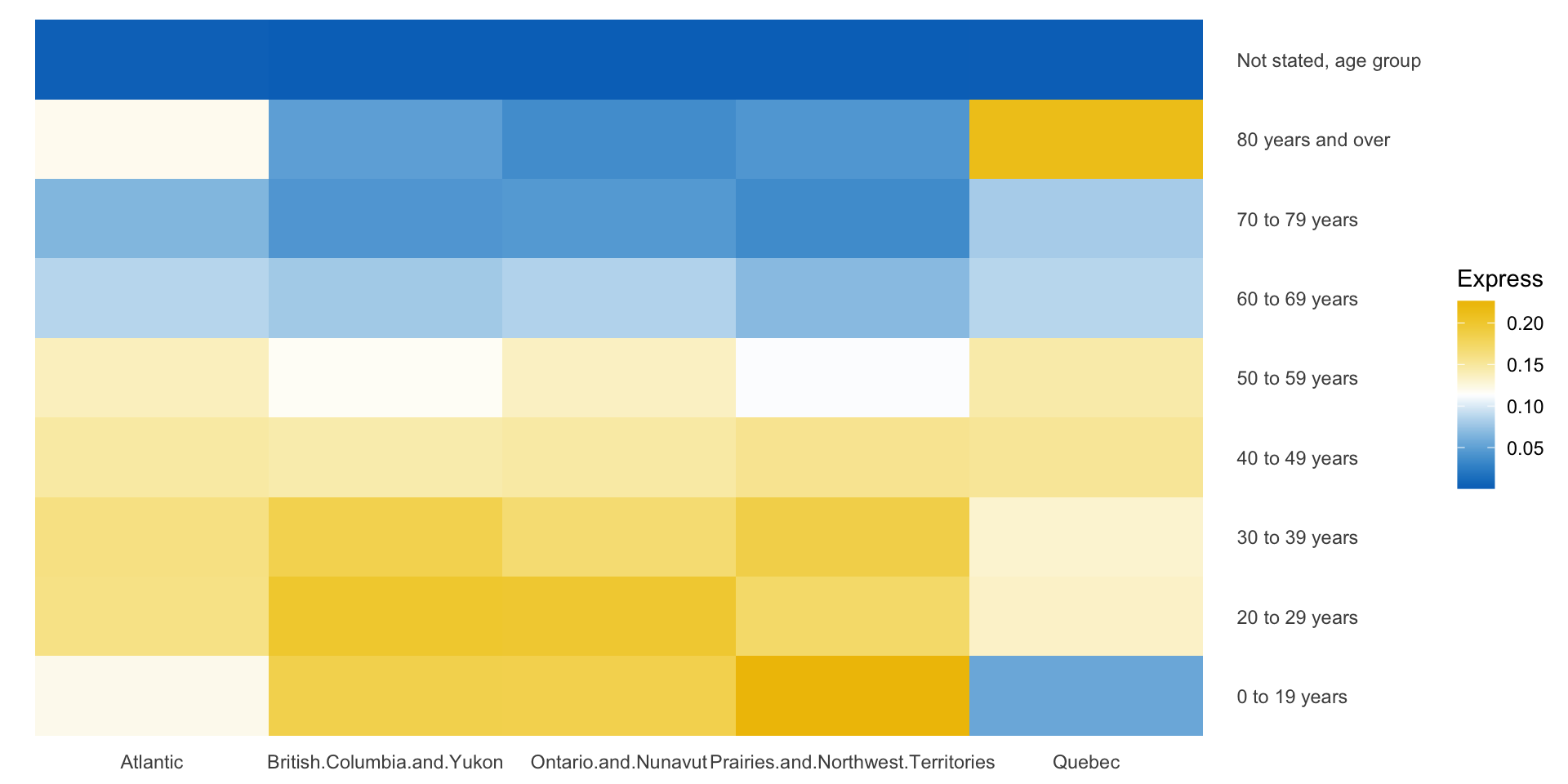
COVID-19 cases & geom_tile
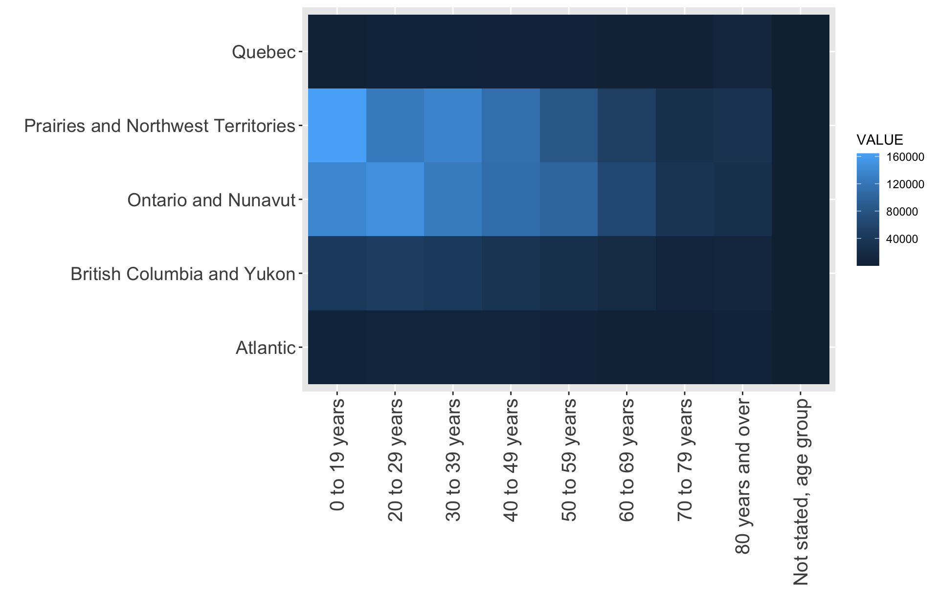
Grouping rows
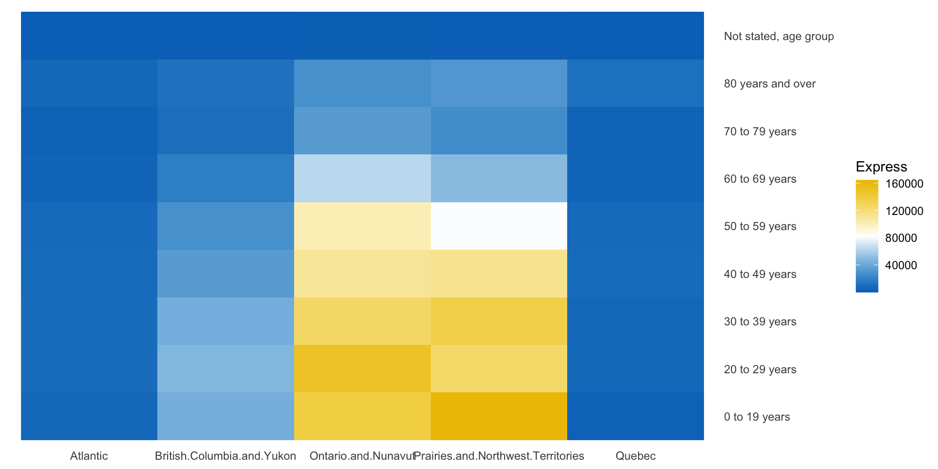
Scaling
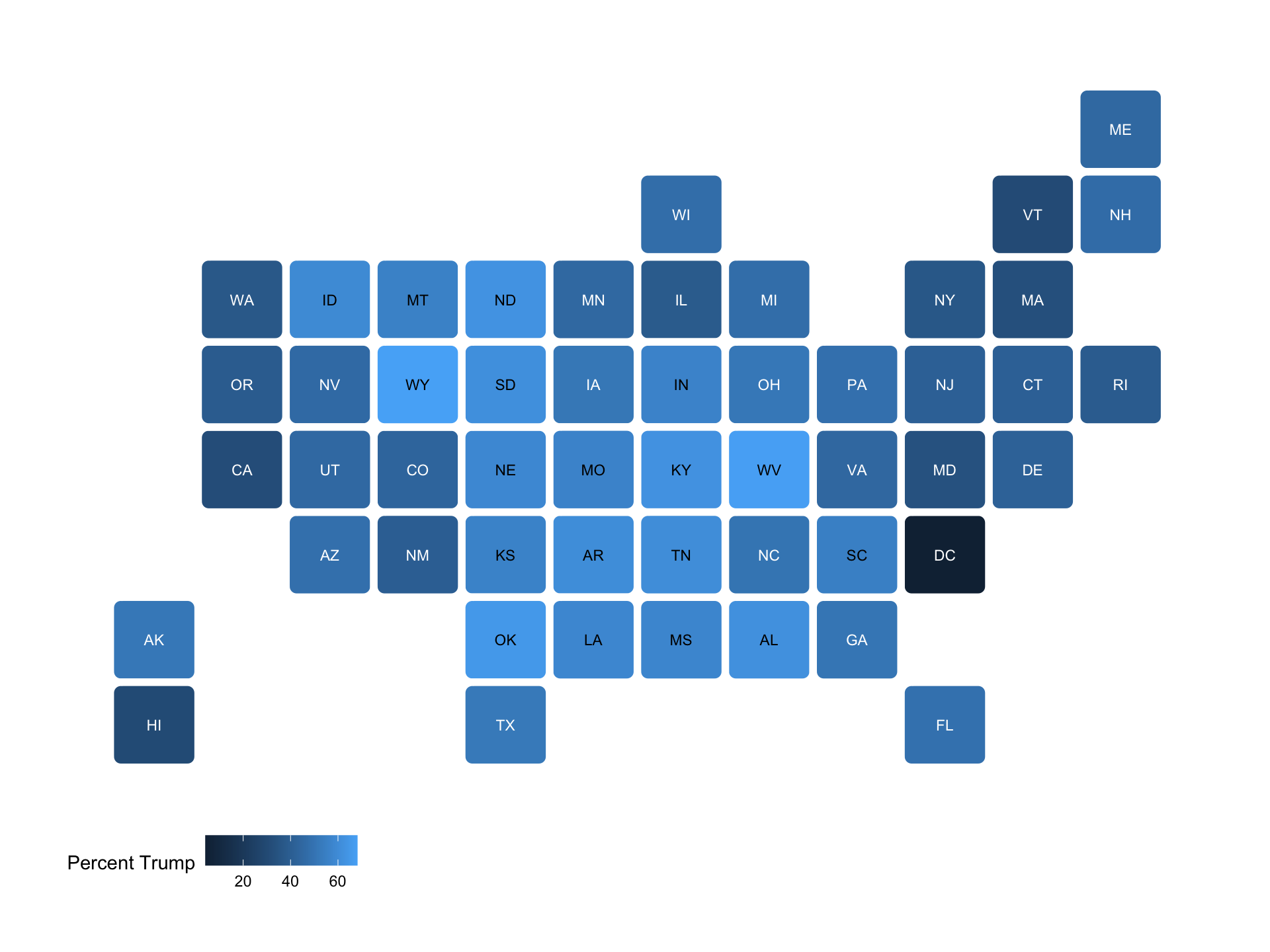
Specialized maps of USA
Global version
See assignment 5