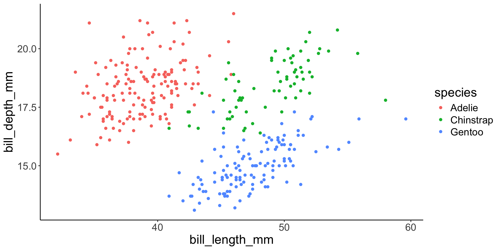
p1 <- penguins |> plot_ly(x = ~ body_mass_g, y = ~ bill_length_mm) |>
  add_markers(color = ~ species)
p1Dynamic graphics
Andrew Irwin, a.irwin@dal.ca
2026-03-19
Plan
Advantages and disadvantages of dynamic graphics
When should you use dynamic graphics?
Examples
Application in this course
When and Why should you use dynamic graphics?
Interactivity
Show changes over time (in the data) over time (as perceived by the viewer)
Easy to make too complicated
Requires interaction and may not immediately make the point you want to make
Distracting
Highlights and interaction
Animations
Make a regular ggplot, then use a variable to show how it changes over time.
Animations
Easy to create with gganimate. Make a regular ggplot, then use a variable to show how it changes over time.
Shown on next slide.
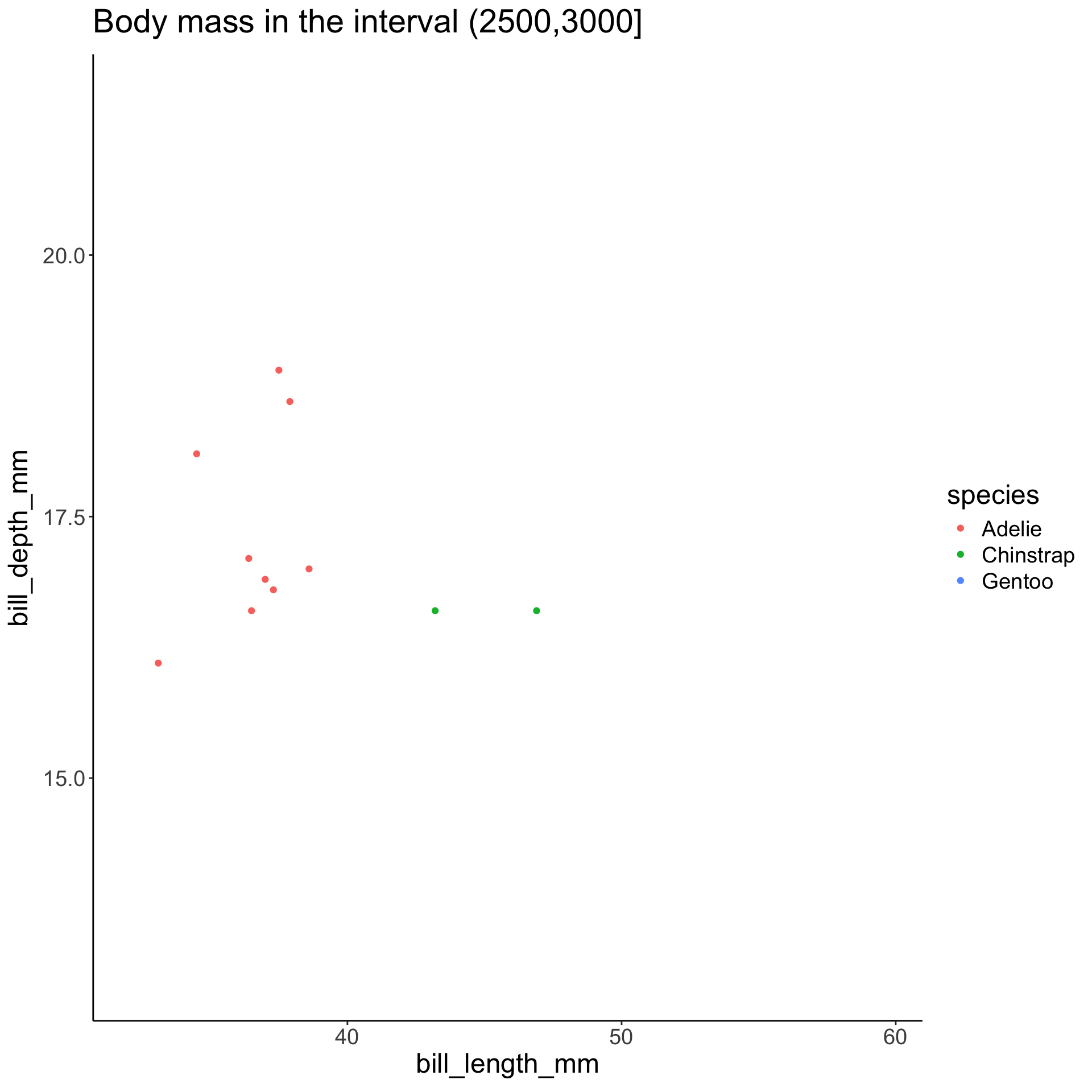
b = seq(from = 2500, to = 6500, by = 500)
anim1 <- penguins |>
  mutate(size_class = cut(body_mass_g, breaks=b, dig.lab=4),
         group=1:n()) |>
  ggplot(aes(bill_length_mm, bill_depth_mm,
             color = species, group=group)) +
  geom_point() +
  labs(title = "Body mass in the interval {closest_state}") +
  transition_states(size_class) +
  enter_fade() + exit_fade() + my_theme
Animations
Summary
Dynamic and interactive graphics can be fun to create
Making good use of these features requires practice
Use sparingly! Think of your audience and goals
-
Good examples:
- Rosling’s animation of gapminder data over years
- blue whale avoiding ships
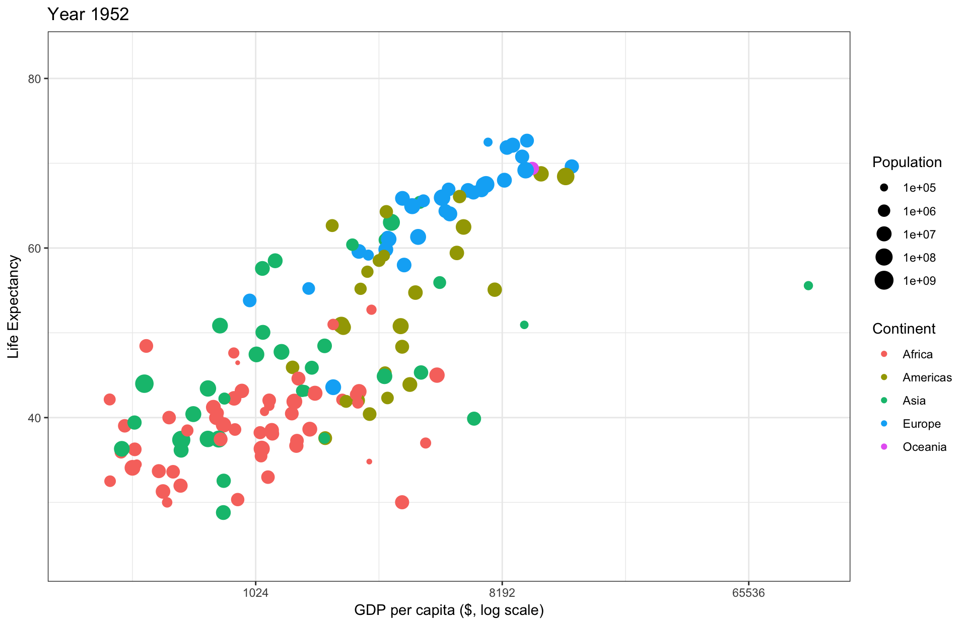
A version of Rosling’s graph
animation <- gapminder::gapminder |>
  ggplot() +
  geom_text(aes(label = format(round(year))),
            x = 3.8, y = 50,
            size = 40, color = "lightgray") +
  geom_point(aes(x = gdpPercap,
             y = lifeExp,
             size = pop,
             color = continent)) +
  theme_bw() +
  scale_x_continuous(trans = "log2") +
  scale_size_continuous(trans = "log10") +
  transition_time(year) +
  labs(title = "Year {frame_time}", x = "GDP per capita ($, log scale)", y = "Life Expectancy", size = "Population", color = "Continent")
A version of Rosling’s graph