

Grammar of Graphics
Andrew Irwin, a.irwin@dal.ca
Math & Stats, Dalhousie University
2026-01-20
Development
What is the grammar of graphics?
-
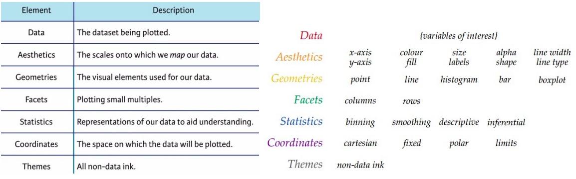
A way of describing a visualization
- Data
- Mapping from data to aesthetic features
- Geometry
- Scales
- Facets
- Statistics
- Coordinates
- Themes
What is the grammar of graphics?
Data
We will use “tidy data” arranged in a table
- columns are variable
- rows are observations
This arrangement makes it easy to use one variable for each aesthetic feature of a plot (axis position, colour, facet, text labels, …)
Aesthetic mappings
We map variables to features of the graph
- x, y axis position
- colour (outline, fill)
- symbol shape, size
- line type
- error bars
- many more used less frequently, depending on the geometry
Discrete and quantitative variables are handled the same way. The details of the scale and geometry will determine their interpretation.
Scales
Range of values on x or y axis; formatting of axis labels
Mapping from values to a discrete or continuous colour scale; choice of colours
Mapping from values to a shape, or line thickness, or symbol size
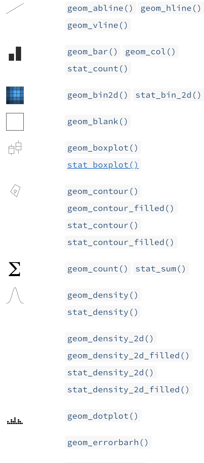
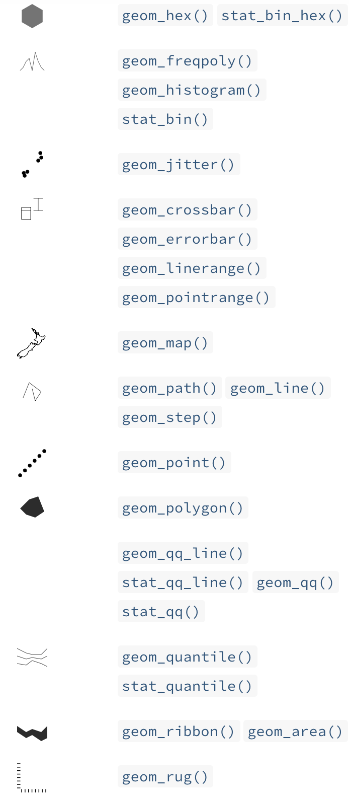
Geometry
What kind of plot do you want?
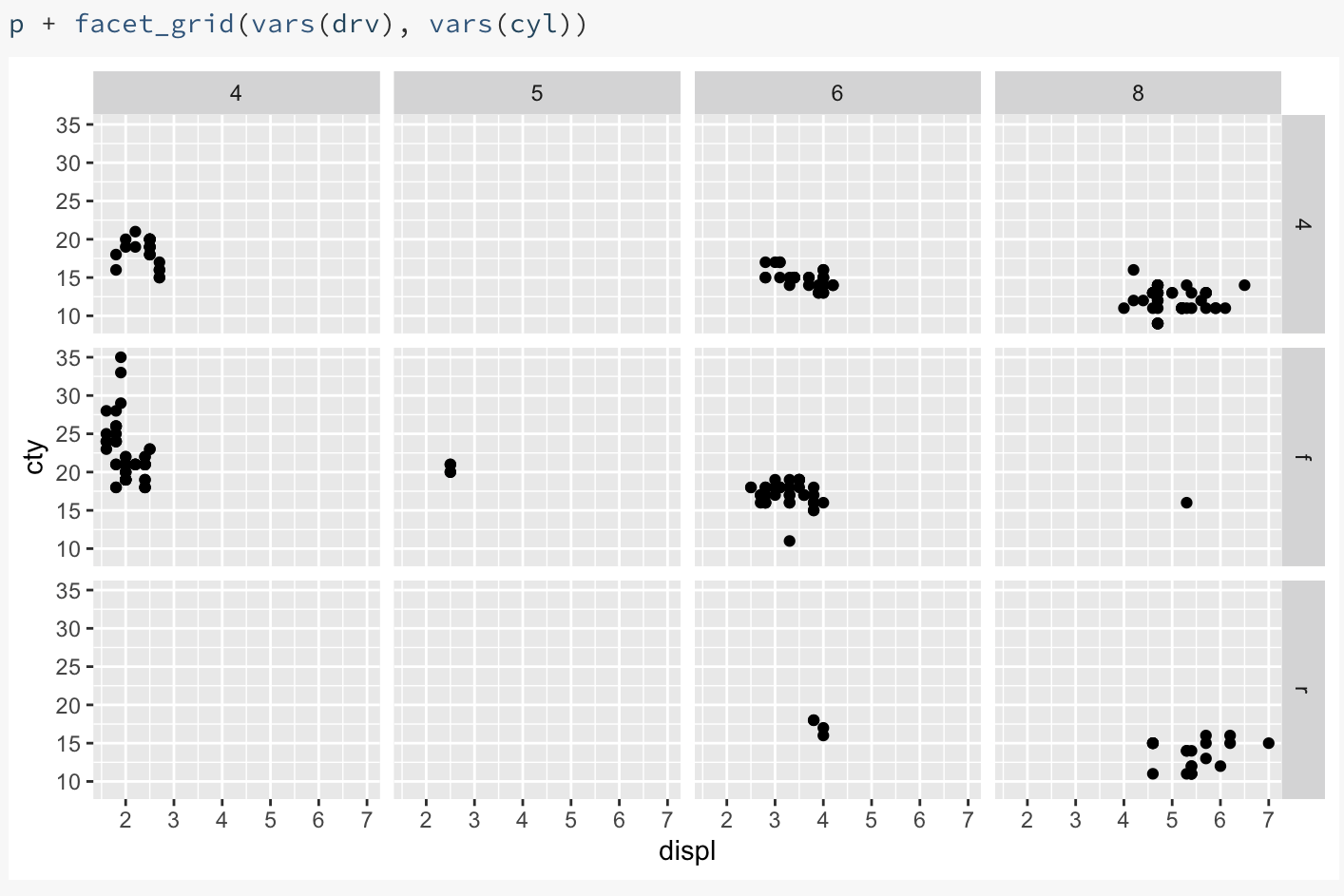
Facets
Statistics & Coordinates
-
Do you want to perform calculations on your data before plotting?
- Calculate average and standard deviation
- Smooth data
- Add a regression line
-
What coordinate system do you want to use?
- Cartesian (x-y)
- Polar (r, \(\theta\))
- Map projections
Annotation & Theme
All the “non-data ink”:
- Titles, axis labels, tick marks
- Background shading, box around plot
- How and where the legend (colour, shape) is displayed
- Other annotations - shading, text
Summary
The grammar of graphics is a way of describing a visualization.
ggplot2is a computer implementation of this idea.Other implementations are available for python (plotnine), javascript (D3), julia (Gadfly).
Suggested reading
- Course notes
Self-quiz / Bonus task
Aesthetics are mappings between variables in your dataset and your visualization, defined using the aes function.
Which of the following is a possible aesthetic mapping for the gapminder data set?
aes(country = x, pop = y)aes(x = country, y = pop)aes(x <- country, y <- pop)
Self-quiz / Bonus task
The geometry (or geom) of a plot determines how the data are displayed in your visualization.
Select the true statement.
- You can have only one geometry, such as
geom_pointper plot - You can use mutiple geoms per plot, for example combining both
geom_plotandgeom_line.
Self-quiz / Bonus task
True or false: To change all the points in a scatterplot to red circles, you need to add variables to your data frame with values “red” and “circle” and map those variables to the colour and shape aesthetic.