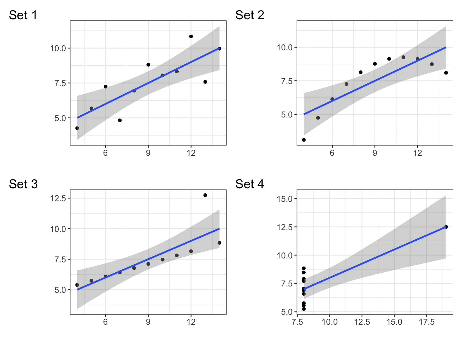
| set | n | x_mean | x_sd | y_mean | y_sd | correlation |
|---|---|---|---|---|---|---|
| 1 | 11 | 9 | 3.3166 | 7.5009 | 2.0316 | 0.8164 |
| 2 | 11 | 9 | 3.3166 | 7.5009 | 2.0317 | 0.8162 |
| 3 | 11 | 9 | 3.3166 | 7.5000 | 2.0304 | 0.8163 |
| 4 | 11 | 9 | 3.3166 | 7.5009 | 2.0306 | 0.8165 |
Look at Data
2026-01-15
Anscombe’s Quartet
Datasaurus Dozen
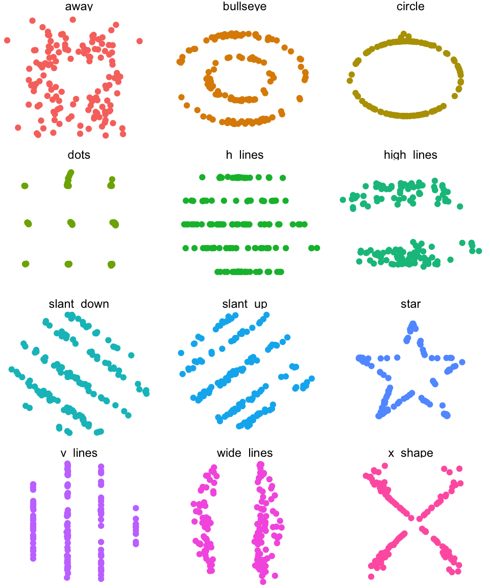
Figure 1: The datasaurus dozen, all with the same mean, standard deviation, and correlation.
Datasaurus Dozen
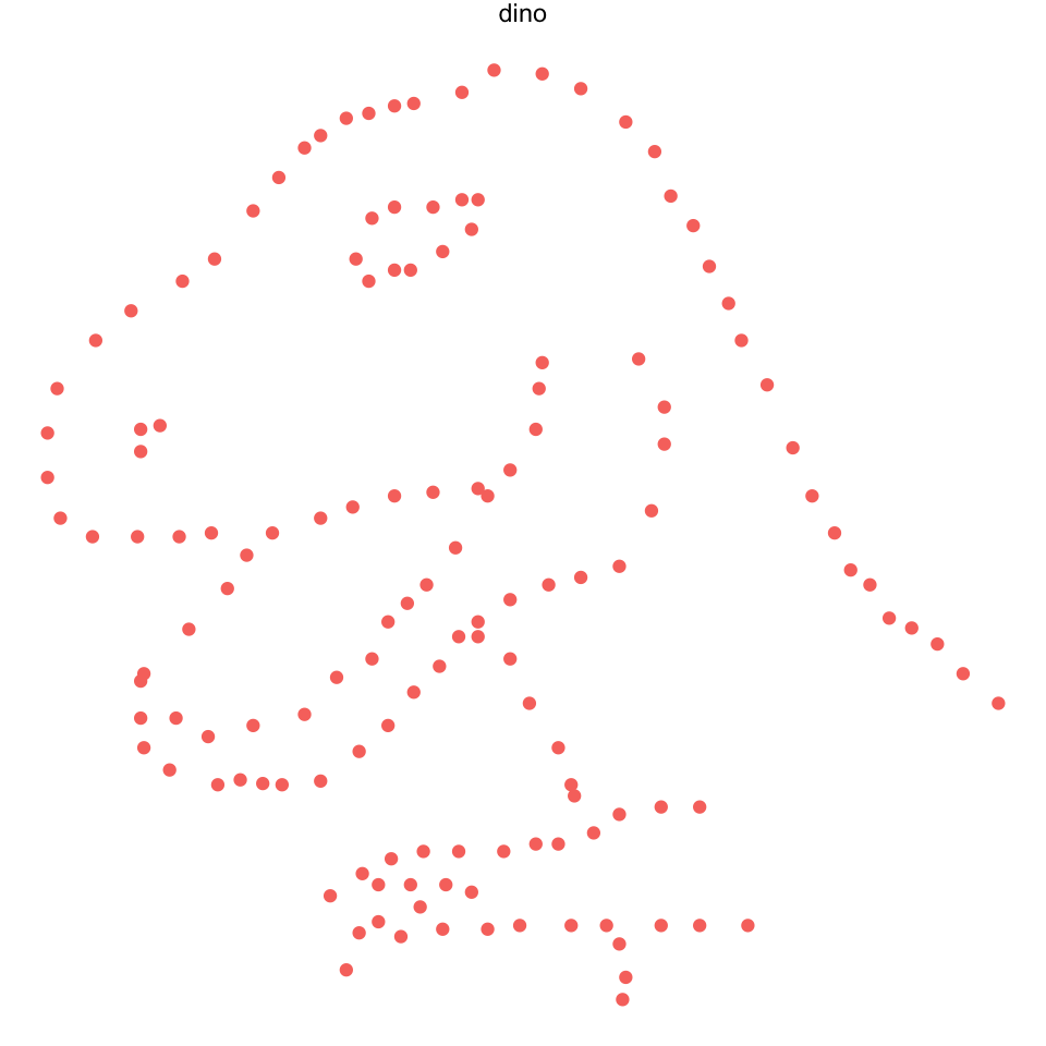
Figure 2: The secret revealed
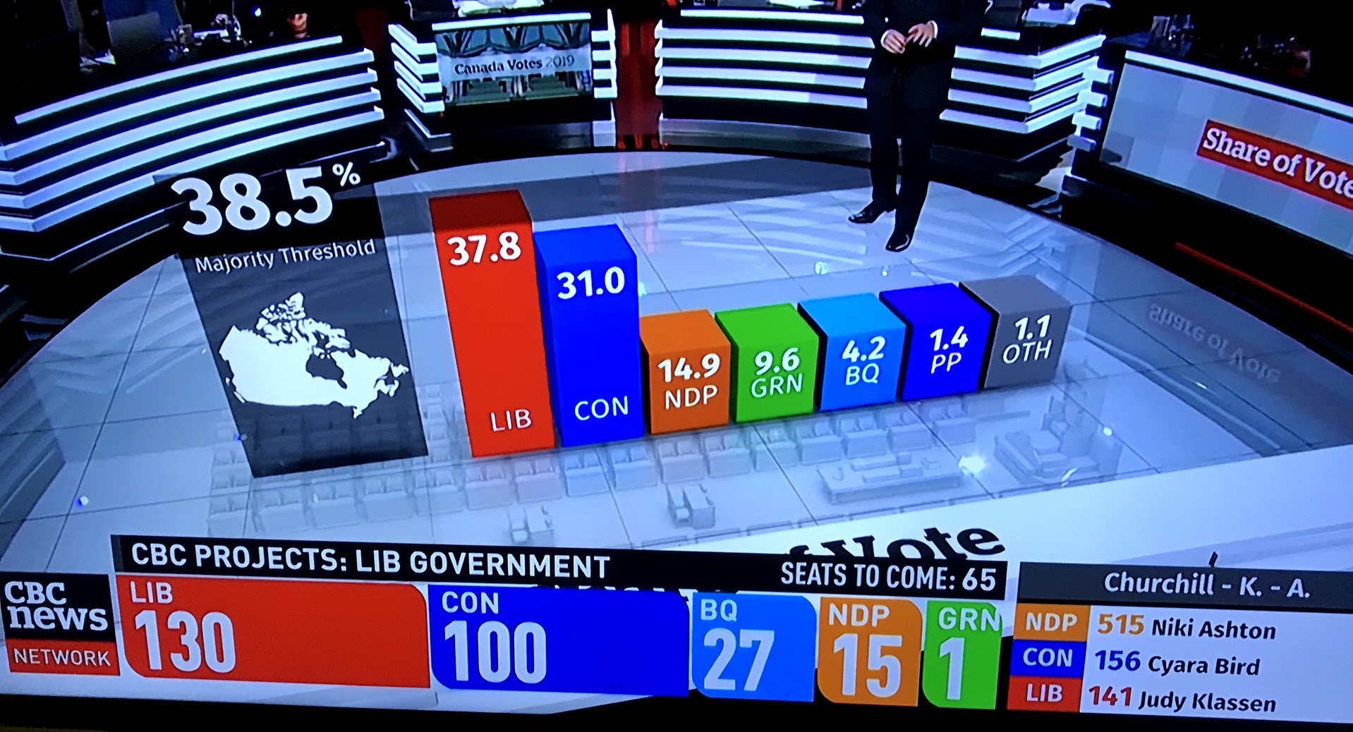
Still from CBC Canadian Federal election coverage, October 21, 2019. Does the three-dimensional bar chart help you understand the election outcome? Are the bars the right height? Is it helpful to have the bar chart appear in the middle of the studio set? Can you judge the height of the bars?
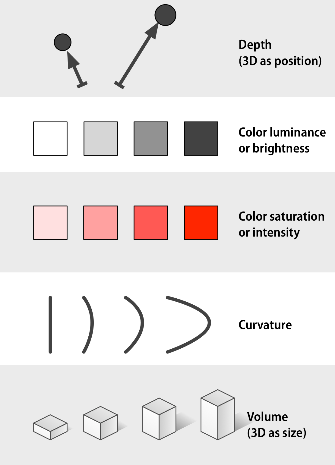
Visual perception

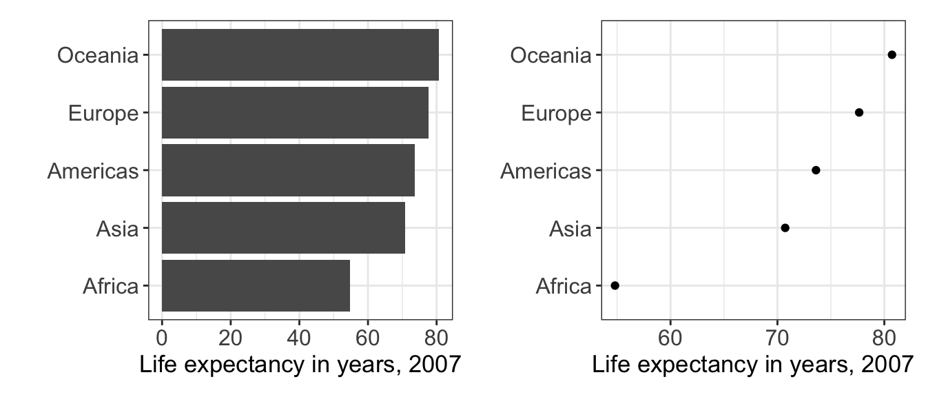
Proportions: bar and pie charts

Figure 3: Wilke. Fig. 10.4.
Proportions: bar and pie charts

Figure 4: Wilke. Fig. 10.6.

Figure 5: The checker shadow illusion.

Figure 6: The checker shadow illusion.
Bars or dots?
Aspect ratio
Healy. Fig. 1.12.
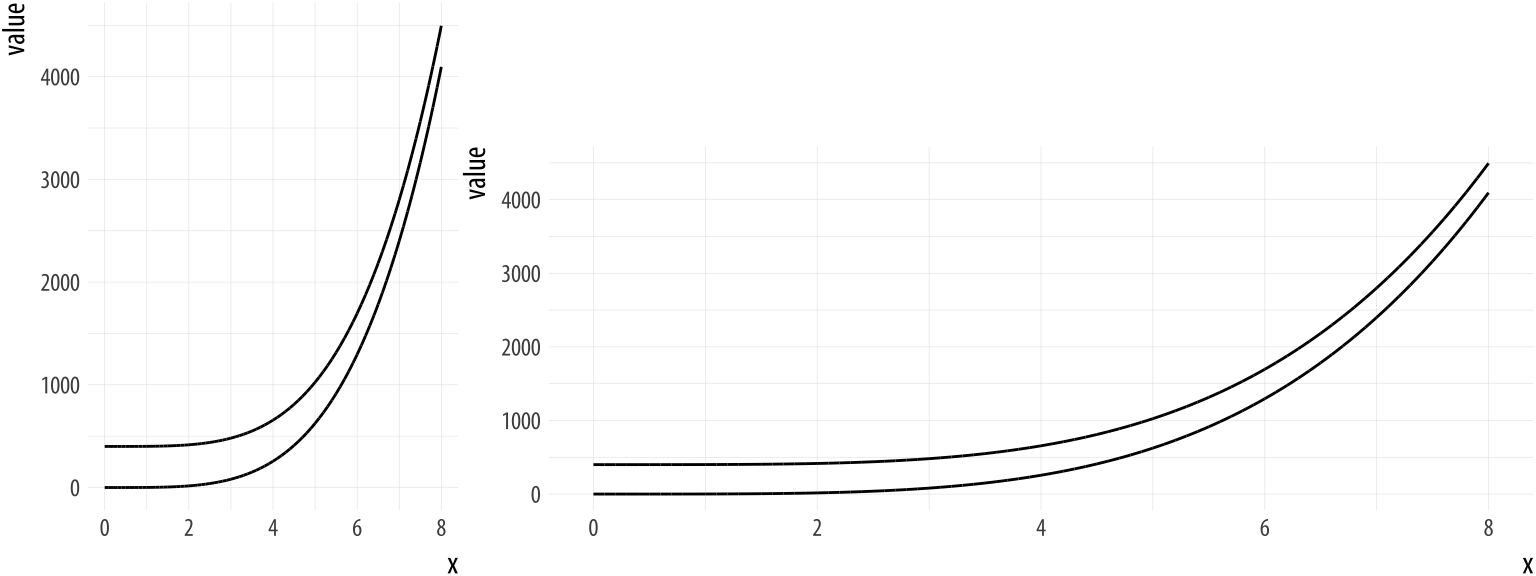
Where to put 0?

Figure 8: Healy. Fig. 1.27.
Where to put 0?

Figure 9: Healy. Fig. 1.27.