Story
- The outbreak was centred on a single water pump on Broad St.
Math & Stats, Dalhousie University
2026-01-08
Asking questions with data.
Telling stories with data.
What is the average amount of CO2 in the atmosphere?
How does this concentration change during the year? Is there a regular pattern?
How does this concentration change from one year to the next?
How does this concentration change from one decade to the next?
Are the interannual patterns stable over decades?
How has this concentration changed over thousands of years?
Are current levels of atmospheric CO2 unusual?
How has Arctic sea ice volume changed over the last few decades?
What is the regular interannual pattern of sea ice volume?
How much variation do we see year to year?
Arctic sea ice volume has shrunk by about 50% and it appears likely that the fall will be ice-free soon
Sea ice volume varies by about 15 thousand cubic km each year, with a peak in May and trough in October
Year to year variation is about 3-4 thousand cubic km, much less than the variation within a year, and about the same as the change in mean volume across a decade.
Fertility decreases as income increases, regardless of the country
The animation (or a series of stills) makes this point more convincingly
We have predictions for temperature and precipitation for the next week. The example shows the amount of variation that occurs within a day, and from day to day, in September.
What can we say about longer term patterns, averaged over many years, and displayed for all seasons?
Seasonal variation is about 24°C, daily variation is about 8°C, and year to year variation is about 7-14°C.
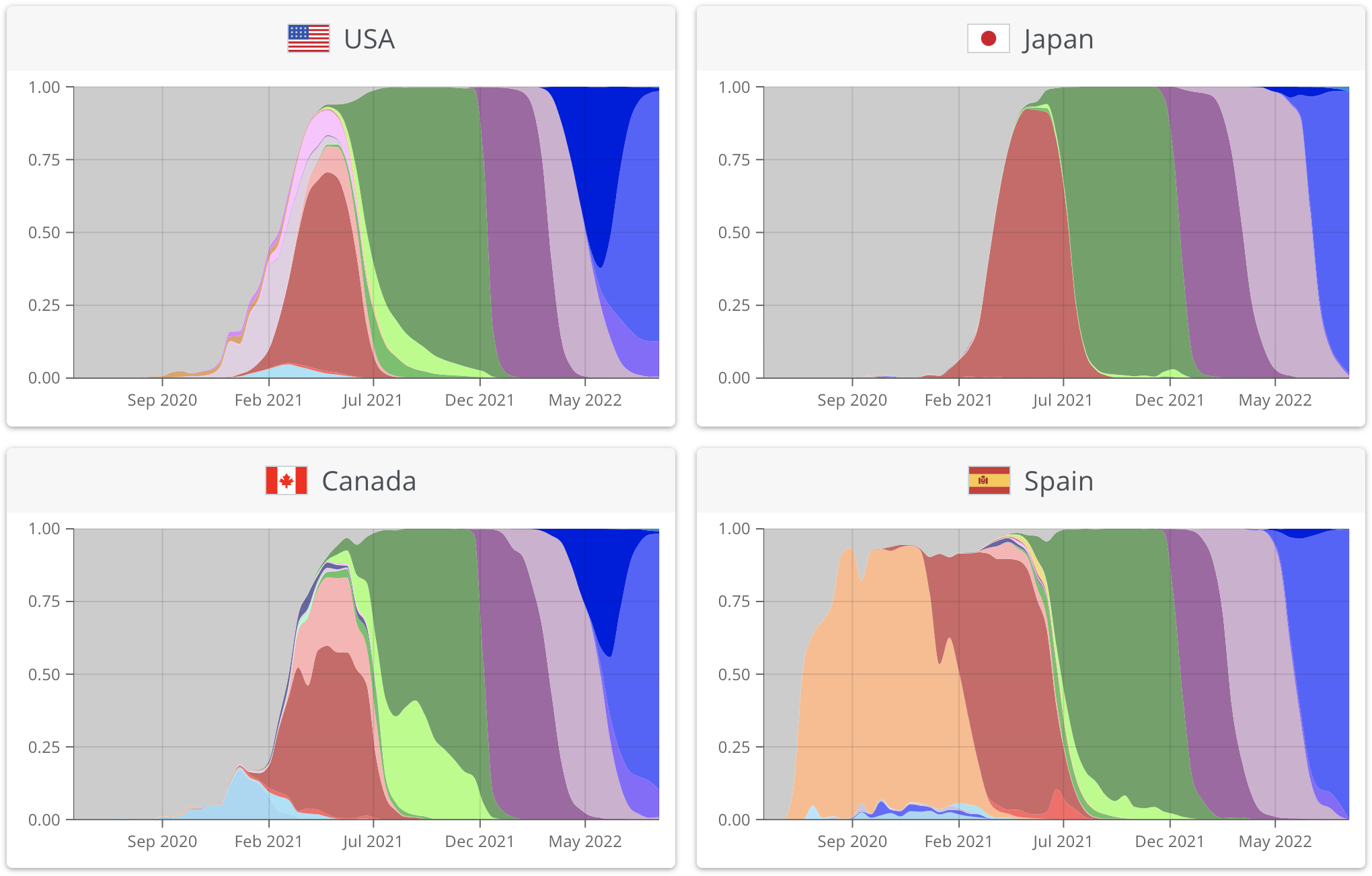
Each color is a variant. Data from covariants.org
What is data visualization?
Turn data into images
Iterative process to explore data
Filter, summarize, and present data
Summarize data compactly
Leverage vision machinery in brain
Helps you tell a story with data
A familiar visualization tells a story “by itself”
Effective communication aid
Memorable & understandable
Aesthetically pleasing - nothing confusing, jarring, or out of place
Course notes: Welcome
Course notes: Invitation to Data Visualization
Wilke: Chapter 29: Telling a story and making a point
Video: Hans Rosling’s TED talk (linked in “Invitation”)
Video: Excerpt from Claus Wilke’s talk for the Santa Fe Institute (linked in “Invitation”)
Prepare a short report on two visualizations you like or could improve on.
Details in Course notes (Detailed outline, Evaluation)
Submit on Brightspace, due Friday, January 23 at 11:59 PM